Wayfinding at Design Museum Holon
Written on 2 July 2011
Yesterday, I arranged to meet a friend at the main entrance to the BFI. We were both there at 12pm, but only managed to meet at 12:25 after she cleverly thought to ask whether the BFI has more than one entrance. I’m sure this sort of confusion happens often in places where the official entrance is off a side-street and what seems to be the obvious entrance isn’t in fact the primary one.
We got talking about mental models, spatial legibility and wayfinding, when I was presented with a question that seemed impossible to answer responsibly without taking up the whole afternoon: “What is the best wayfinding design you had come across?”, the answer to which heavily depends on the metrics used when evaluating the success of the design and I was unable to recall a single example that satisfies all key criteria.
Some of the most functional wayfinding systems I know, those that effectively help people navigate through an environment, aren’t particularly aesthetically appealing; some highly imaginative and beautifully crafted designs provide a pleasing experience, which in turn is undermined by the frustration rendered by their impracticality. Another typical evaluation criteria would be the level to which the design is sensitive to the physical context in terms of placement, choice of materials, colours, form, typography etc… and the extent to which this supports or inhibits the desired visitor experience.
On top of that, what was meant by ‘wayfinding design’ – was it the graphic, information and product design of a single sign; the design of a system of signs and how the content included in each supports the procedural process of wayfinding; or perhaps the design and manipulation of the physical environment to support effective wayfinding, based on considerations such as spatial complexity and sight-lines to destinations from different locations throughout the site?
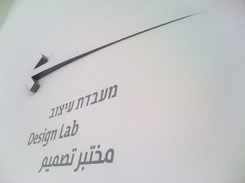
I struggled to come up with an example for the best wayfinding design, however a particularly inspiring example that sprung to mind was Adi Stern’s wayfinding design for the Design Museum in Holon. It is clever, imaginative, original, highly functional and literally integrated into the interior space.
Design Museum Holon was designed by Ron Arad and bears some resemblance to Frank Lloyd Wright’s design of the Guggenheim in New York. Undoubtedly, the building’s key defining feature is its exterior which is made up of organically curled ‘ribbons’ of Corten. As demonstrated in the post-construction video below, the architecture itself supports wayfinding by delineating the path towards the main museum entrance.
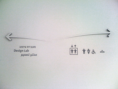
The dynamic external structure is referenced by the curved three-dimensional arrows used internally for wayfinding communication. These arrows extrude in to the space, as if peeling out of the wall, their fascia retained in white as black edges and shadow create a Gestalt effect ensuring we identify the white arrows.
Overall, the site is relatively simple to navigate with only a handful of decision-points and sub-destinations, eliminating the need to clutter the space with too much directional information. Throughout the site, explicit wayfinding information is displayed only where it is absolutely necessary. No extraneous information is provided – a minimal design is used to communicate to visitors only the bare essentials.
On all three tiers, the single sign, the sign system and the spatial design, this is one of the most inspiring examples of wayfinding design I have seen in recent years.
What do you think?
Content :
- Don't judge a book by its cover — — judge it by its spine
- Wayfinding at Design Museum Holon
- The Type Shop
- Issey Miyake pulls Dyson apart
- From Wayfinding to Thingfinding
- Place for words
- DoubleYou Hi
- Mission: Menu
- I Feel Fine, Thank You
- Banalities of the Perfect Home
- The Feltron Report
- Dashanzi Art District


